8. The dashboard card
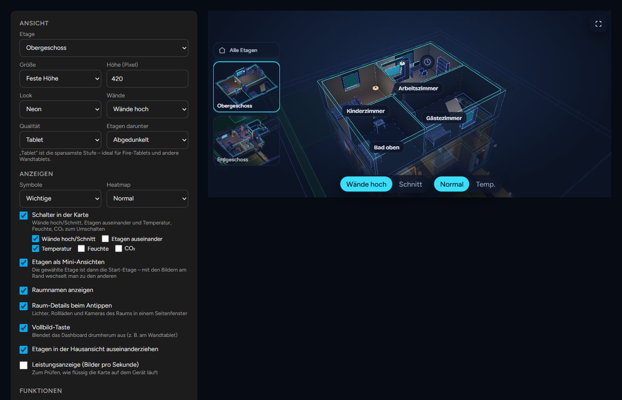
The card custom:neonplan3d-card brings the 3D view into any dashboard. It loads automatically.
Adding it: Edit the dashboard, Add card, search for "NeonPlan". Set every option in the card's visual editor:
| Section | Options |
|---|---|
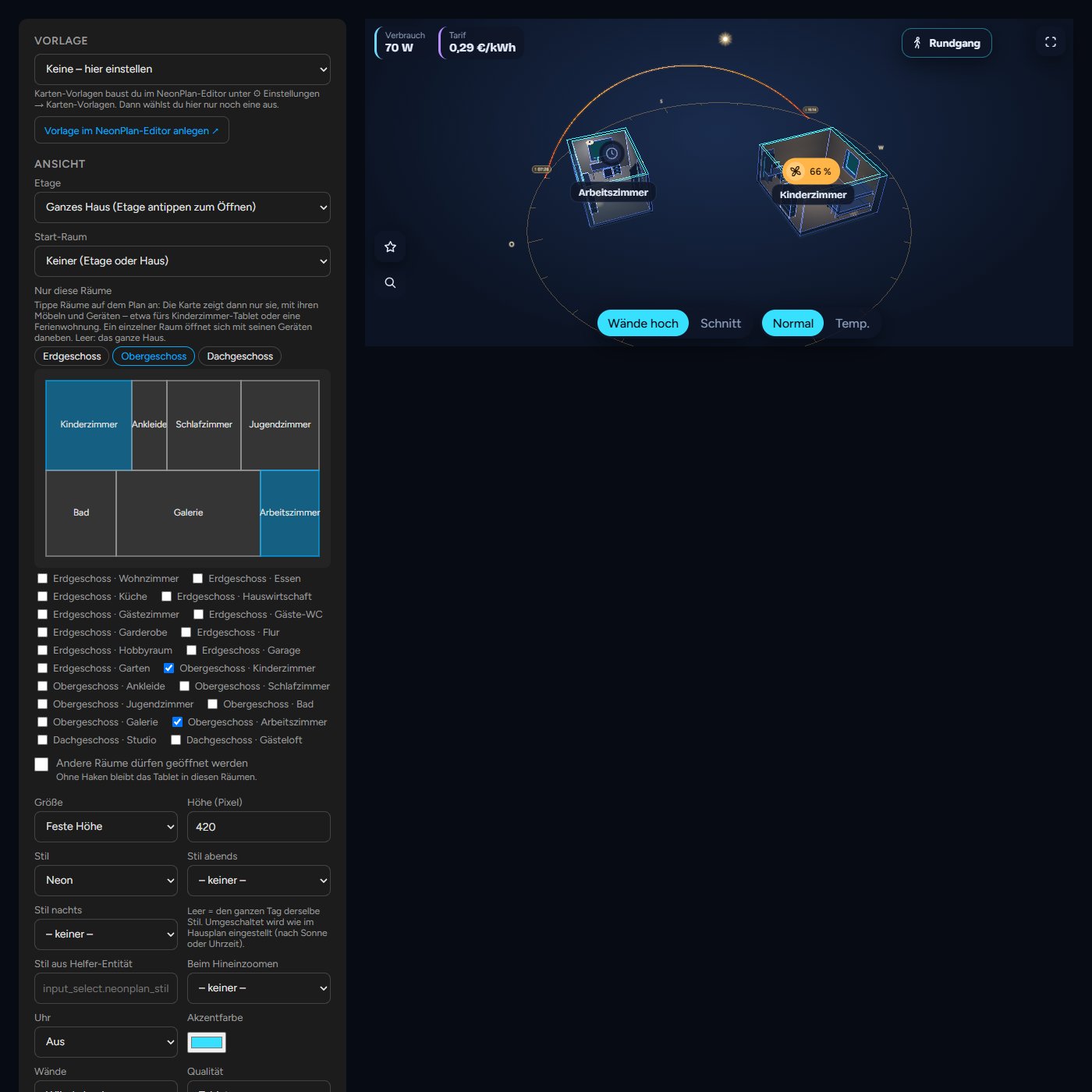
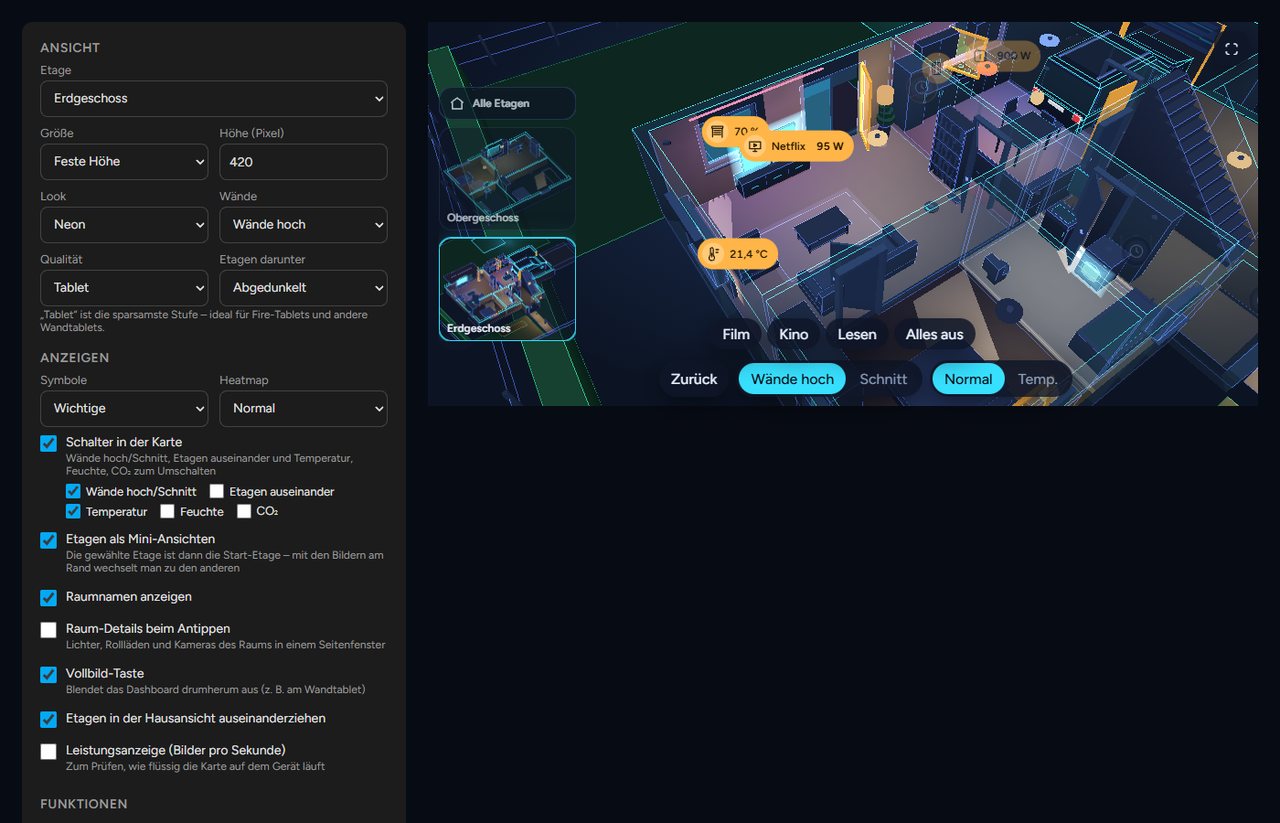
| View | Floor plan (also the property), one floor or the whole house, start room, only these rooms, fixed size or full screen, height, look, walls, quality, floors below |
| Show | Markers, heatmap (also "values"), floor plan only (no furniture), switches in the card, 3D lock, keep view, walk, controls left or right, floor pictures, room names, room panel, full-screen button, clock (corner of your choice, clock: tl/tr/bl/br), floors apart, performance display |
| Features | Warnings, jump to a warning, voice control with screen name and room for "here", scene buttons, motion trail, camera wall, time travel with range and speed, weather with weather entity |
| Wall tablet (kiosk) | Back to the start view, night dimming, camera turn as screensaver |
Glass cards on narrow cards (since 3.1.1): when the card is narrower than 600 px or runs at the tablet level, glass cards such as the heat pump's leave their minor values out (starts, run time, history). A tap on more at the bottom of the glass card shows them on this device, less hides them again.
8.1 Card templates
Instead of setting up every card on every tablet, you build it once in the editor: ⚙ Settings → 🖥 Card templates → + New template. Give it a name (e.g. "Kitchen Fire tablet") and set everything below, with the same form as in Home Assistant's card dialog. Duplicate makes a copy to start the next tablet from.
On the tablet: add a card, search for "NeonPlan" and pick the template under Template at the very top, done. The form below goes away. The YAML has two lines only:
type: custom:neonplan3d-card
template: kitchen_fire- Changing it: when you change the template in the editor, every tablet with this template follows after a moment by itself, without a reload.
- The template counts, the size stays with the card: a card with a template shows the template. Only its size (Fill the screen, Height, Full-screen button) comes from its own YAML, as it belongs to the dashboard. Whatever else is still in the card's YAML from before no longer applies; the card dialog lists it and Tidy up removes it. For a tablet that should look different, give it a template of its own (Duplicate).
- Straight away or with a button: under Changes each template is either Straight to the tablets (the default) or Send with a button. Then only the preview shows your changes; the tablets keep the old state until you press Send to the tablets. Discard drops the changes.
- Where does the tablet hang? The field at the top of the template sets the room for "here" ("Turn on the lights here"), whatever floor or start room the card shows.
- Renaming: the id in the YAML follows the new name. Tablets still set up with the old id keep finding the template.
- Screen name: the template's name is also the card's screen name (for announcements and "here" in voice control), as long as the template has none of its own.
- Reload: Reload screens with this template and Reload all screens make the open tablets load their page again, e.g. after a NeonPlan update (new code only arrives that way). Automations have the action
neonplan3d.reload_screensfor it (withouttemplates: every screen). - Deleted: when the template is missing from the plan, the card shows a note and carries on with its own settings.
8.2 All options in YAML
In YAML a card looks like this. Every line except the first is optional:
type: custom:neonplan3d-card
template: kitchen_fire  # a card template from the editor (then only it counts, not the other lines)
plan: pab12cd34ef      # another floor plan (id under ⚙ → Floor plans; left out = the first); site = the property
floor: floor_ab12cd34   # show one floor (id from the editor)
room: room_ab12cd34     # start in this room (the id is in the editor's room form), e.g. a display for the kids' room
rooms: [room_ab12cd34] # show only these rooms (see 8.3)
rooms_lock: true       # false: other rooms may be opened
height: 420             # height in pixels
fill: false             # fill the screen below the header
walls: auto             # auto | cut
controls_side: left     # left | right: floor pictures, star, search and eye on the right
keep_view: false        # true: floor switches keep the camera
angle_lock: false       # true: 3D lock – the angle stays fixed, a drag moves the view
explode: true           # pull floors apart in the house view
floor_stack: dim        # floors below: dim | stacked | single
quality: auto           # auto | low | high
theme: neon             # neon | blueprint | day | focus | synth | cozy | evening | winter | model | pastel | warm | my_… (own style) | auto | house
theme_evening: evening  # optional: style in the evening (by the house plan)
theme_night: focus      # optional: style at night
style_entity: input_select.neonplan_style  # optional: helper whose state names a style
accent: "#ff8a00"       # an accent colour of your own (neon lines, buttons, pins); leave out for cyan
markers: important      # none | room | important | all
marker_size: normal     # small | normal | large
marker_names: false     # true: devices with an own name show it under their marker
central: true           # the star with the central menu (all lights, blinds, favourites)
buttons:                # own buttons for this card only (replace the ones from the editor)
  - label: Blinds
    icon: window-shutter
    action: fire_dom_event   # navigate | more_info | service | fire_dom_event
    data: { browser_mod: { service: browser_mod.popup, data: { title: Blinds, content: { type: "custom:my-blind-card" } } } }
heatmap: none           # none | temperature | humidity | co2 | values (numbers at the room names)
room_panel: true        # tapping a room opens the room panel
room_names: true
controls: true          # switches in the card, or a list: walls, floors, temperature, humidity, co2
controls_hidden: false  # true: start with the controls hidden (only the 3D view); an eye at the bottom left brings them back
controls_hide_after: 0  # seconds without a touch after which the controls disappear (0 = never); a touch shows them again
floor_thumbs: true
fullscreen_button: false
dashboard: /lovelace/home   # a button at the top right that opens this dashboard (leave out = no button)
dashboard_label: Home       # label of the button; without one it shows ⌂
stats: false
alerts: true
alert_jump: false       # jump into the room of a new warning
scenes: true
motion_trail: false     # Pro: camera cockpit
weather: true           # Pro: weather outside
weather_entity: weather.home
holograms: true         # Pro: holograms always on/off; leave out = a switch in the card
camera_wall: false      # Pro: a "Cameras" button at the bottom of the card opens the camera wall
time_travel: false      # Pro: a "Time travel" button at the bottom of the card replays the last 24 hours (view only)
time_travel_speed: 360  # time travel speed: 60 | 360 | 900 | 3600 | 14400 (one hour in 1 min, 10 s, 4 s, 1 s; a day in 6 s, week only)
time_travel_range: 24h  # time travel starts with: 24h or 7d (the week; also at the Tablet level, which else holds two days)
roof: true              # false: show the house without its roof
roof_fade: true         # false: the roof stays on the house while zooming in
plain: false            # true: floor plan only – walls, doors, windows and stairs without furniture
start_view: { theta: 0.8, phi: 1.0, radius: 20 }   # a start view of this card's own; the line is shown in the editor under Start view (leave out = the plan's)
idle_return: 0          # seconds without a touch until the start view
night: "off"            # off | sun | "22:00-06:00"
idle_orbit: false
8.3 Cards for single rooms (new in 3.0)
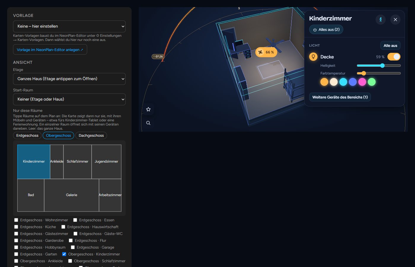
In the card dialog under Only these rooms, tap rooms on the small view from above (or tick them below). The card then shows only them, with their furniture, devices, doors and windows; the other rooms, floors and the roof are left out. That is ideal for the tablet in the kids' room, a granny flat or the guest room. On old tablets it runs even more smoothly, because only these rooms are drawn.
- One room opens with its devices beside it right away. "Here" in voice control then means that room.
- The tablet stays in these rooms: taps, search and jumps do not lead out. Other rooms may be opened lifts that.
- Shortcut in the editor: select a room → 🖥 Card for this room makes a card template with only this room and opens it. On the tablet you then just pick the template.
- Several floor plans: at the top of the card dialog you choose the card's Floor plan, also 🏘 Property with every building together.